Case study | 5 min read
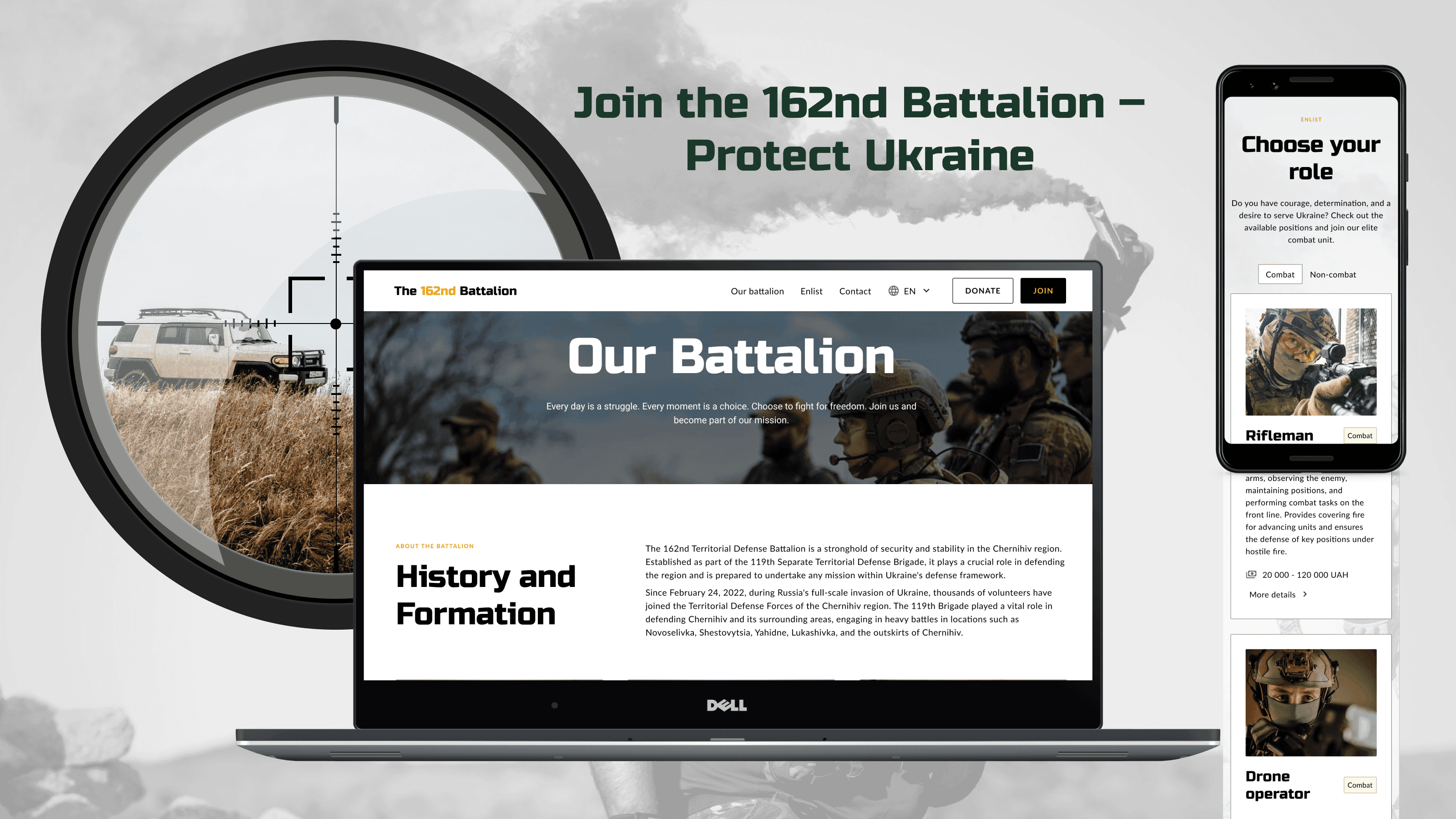
Website for 162nd Battalion of the Ukrainian Armed Forces
The website concept for the 162nd Separate Battalion of the 119th Territorial Defense Brigade of the Armed Forces of Ukraine has been designed with two key objectives in mind: recruiting new volunteers (both combat and non-combat) and acquiring donors and support for the unit.
Timeline
-
Industry
Public Sector / Military
My role
UX/UI Designer & Framer Developer
Project type
Solo project / non-profit concept
Scope
Benchmarking
Information Architecture
Sitemap
Wireframing (lo-fi)
Framer Development
Scroll & Hover Effects
Framer CMS
Responsive Design
If you want to see more, keep scrolling :)
One-minute project overview
Problem
Ukraine’s Armed Forces need a steady flow of volunteers and donor support.
Yet many hesitate to join due to fear of forced mobilization, low trust in institutions, and lack of clear, reliable information — especially about non-combat roles.
Problem space challenges & realisations
Fear & mistrust – Many civilians hesitate to volunteer due to fear of forced deployment and lack of awareness about non-combat roles.
Scattered & outdated info – Official resources are often hard to navigate or outdated, making it unclear how to join or help.
Language barriers – Foreign volunteers face limited access to English-language guidance and support.
Low visibility – The 162nd Battalion lacks a central, trustworthy platform to showcase its mission, team, and needs.
No easy support channels – Donors don’t know how to safely and effectively contribute.
Solution
I designed a comprehensive recruitment and information website prototype in Framer as a conceptual, non-profit project — with the potential for future deployment on a secure, dedicated server. A key feature is a application form that adapts to different enlistment paths (combat and non-combat) for both Ukrainian and international volunteers.
The project scope included:
Target group analysis, user scenarios, and journey mapping
Information architecture, sitemap, personas, and UX flows
Content design, low- and high-fidelity wireframes, and a full UI kit
Responsive prototype implementation in Framer, featuring CMS integration and dynamic form logic
Results
Fully responsive MVP prototype — tested between 320–2400 px
Personalized application paths with separate logic for Ukrainian citizens and international volunteers
Custom CMS system for managing recruitment announcements
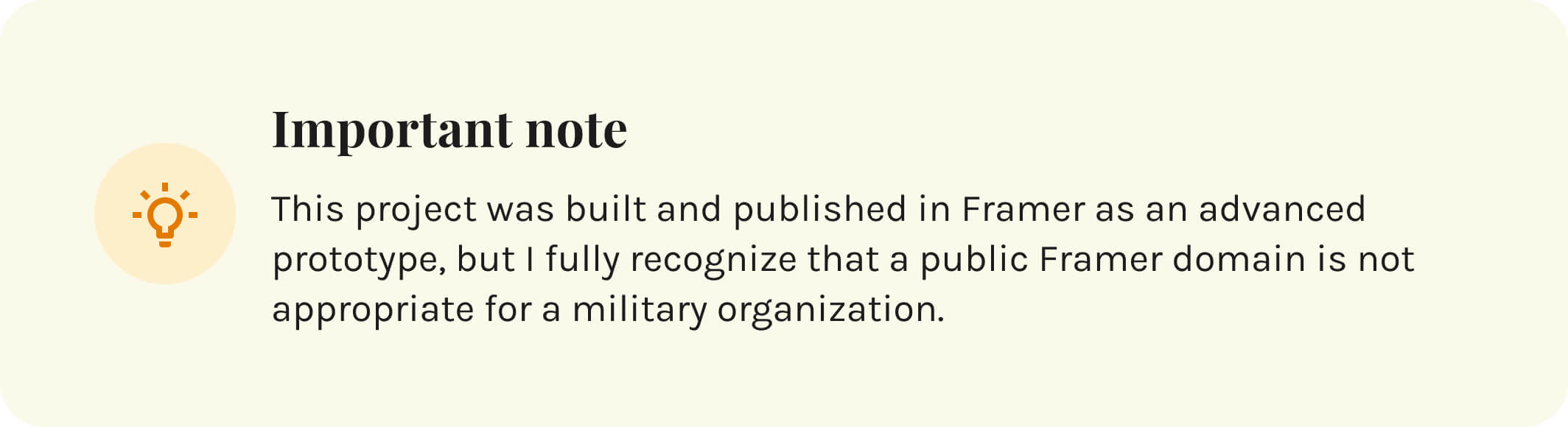
Demo project published in Framer — with full awareness that a real military site should run under a secure, dedicated military domain and be deployed on an internal server
Goals & Success criteria
Research & Insights
Understanding the recruitment context
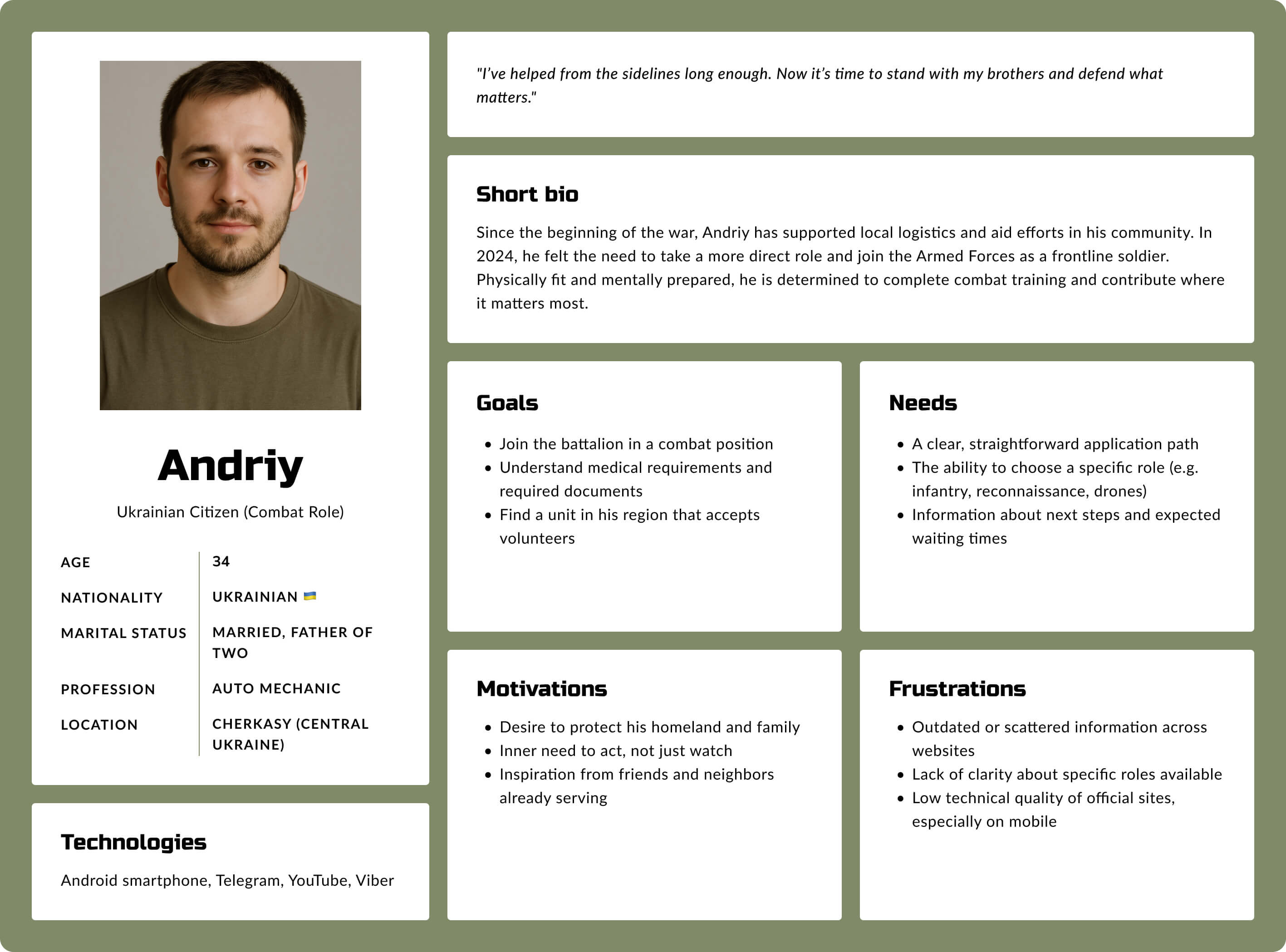
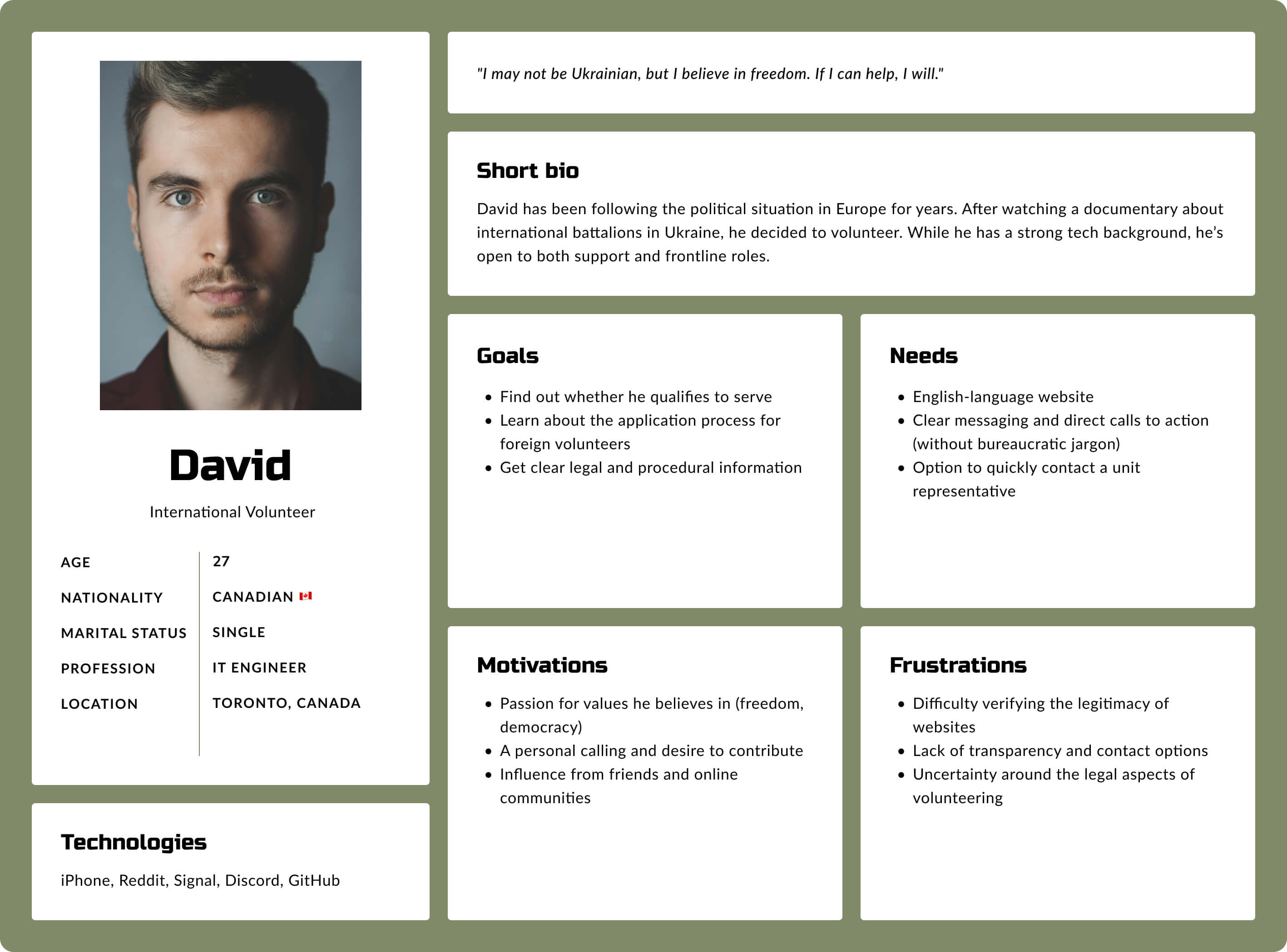
Before designing the recruitment platform for the 162nd Battalion, I conducted contextual and benchmark research to understand the scale, complexity, and emotional nuances of modern military recruitment — both in Ukraine and abroad. My goal was to identify key pain points and user expectations across two main audience segments: Ukrainian citizens and foreign volunteers.
🇺🇦 Local recruitment – strong demand, limited digital tools
Data from official military sources and news reports revealed a steady rise in interest from Ukrainian citizens:
Since early 2024, over 46,800 people consulted local recruitment centers.
Around 17–20% of inquiries convert into formal applications.
In January–February 2025, the average number of monthly queries rose to 5,300–5,600 — an 80% increase year-over-year.
Women made up ~21% of applicants, pointing to the need for gender-inclusive design and content.
These numbers show not only growing public interest but also highlight the importance of intuitive, well-structured digital tools that support recruitment centers in handling demand.
🌍 International volunteers – motivation, but high drop-off risk
I also examined the situation of foreign applicants through open sources and international reports:
In early 2022, up to 20,000 people from 52 countries expressed interest in joining Ukraine’s International Legion.
Experts estimate that only 1,500–2,000 actually joined, and that number has remained stable over time.
Volunteers now come from 70+ countries, with a significant proportion from South America (~40%).
Regional hubs, such as in Poland, processed over 1,500 applications in a few months.
This segment faces legal, cultural, and informational barriers. The data confirmed that a trustworthy, multilingual, and inclusive online presence is essential to convert passive interest into action.
Design implications
Insights | Design response |
|---|---|
High interest with moderate conversion | Clear user flow with personalized onboarding paths |
Growing share of women and foreign applicants | Inclusive tone, gender-neutral language, culturally agnostic visuals |
Confusion around legal processes | Simplified and reassuring explanation of steps |
Lack of trust in unofficial or outdated websites | Clean, professional visual design and secure-feeling interactions |
Limited technical skills in some user segments | Mobile-first, responsive layout with accessible UI patterns |
Methods used:
Benchmarking of recruitment sites (military and civil sector)
Public data analysis (mil.in.ua, mod.gov.ua, Wikipedia, Euromaidan Press)
Persona mapping for two user segments (local / international)
UX strategy & Information architecture
Built for clarity, action & trust
Designing a military recruitment platform required balancing simplicity and credibility. Users needed fast access to reliable info — and confidence in the platform’s safety and purpose.
My approach: reduce friction, humanize communication, and focus on clear, mission-driven design.
Key user needs:
Understand the battalion’s mission and structure;
Explore enlistment and support options (combat & non-combat);
Complete applications easily and confidently;
Access up-to-date, trustworthy information.

Wireframing the core flows
Once the information architecture and content structure were defined, I translated the sitemap into low-fidelity wireframes to validate layout ideas, user flow, and content hierarchy before moving into visual design.

Multi-step application flow
To support clarity and reduce overwhelm, I designed a conditional multi-step form that adapts based on the applicant’s citizenship.
Users first choose whether they are Ukrainian citizens or foreign volunteers — this determines the number and type of questions they’re asked.
Each path ends with a personalized Thank You screen, signed by the fictional recruitment officer, Captain Dmytro Zorich.

UI design & Interaction
Visual design that balances clarity, trust, and purpose
The visual identity of the 162nd Battalion website was carefully crafted in Framer to project credibility, structure, and focus — while remaining emotionally resonant and accessible to a wide range of users.
I intentionally avoided overly “militarized” aesthetics to keep the tone professional, not aggressive. Instead, I used bold typography, clean layouts, and strong contrast to convey strength, purpose, and clarity — all brought to life using Framer’s flexible layout system and real-time interaction capabilities.
UI Kit
To support scalability, reusability, and consistent interaction patterns, I developed a comprehensive UI Kit in both Figma (for design exploration and documentation) and Framer (for live prototyping and component logic).
The system includes all essential building blocks:
Base tokens: Typography scale and color system
Interactive elements: CTA button variants, input fields, text areas, checkboxes, radio buttons, select fields, segmented controls
Navigation: Navbar, dropdown menus
Forms & logic: Full application form with validation states, file upload component, stepper for multi-step flows
Content components: Cards, accordions, headers
Each element was created with responsiveness, accessibility, and flexibility in mind — ensuring smooth adaptation across screen sizes and content types. The components are fully integrated with Framer’s CMS, allowing non-designers to reuse them while maintaining design consistency.

CMS-driven structure
The prototype is powered by a custom CMS built in Framer, designed to support easy content management without technical knowledge.
At this stage, the CMS allows for quick updates to recruitment-related information — such as role descriptions, eligibility details, and application instructions. This makes it easy to keep critical user-facing content current and relevant.
The CMS is structured with future scalability in mind, allowing for the potential expansion to manage FAQs, updates, or donor communications — should the project be deployed on a live, secure environment.

Expert review
Testing with expert eyes
While I didn’t run formal usability sessions with users, the final version of the prototype was reviewed by Tomasz Biskup – CEO at Klika and lead instructor of the Framer design program, who provided an in-depth assessment of both design and implementation.
His feedback covered all key aspects of the project — structure, clarity, accessibility, responsiveness, component logic, and technical quality.
Positive highlights from the review:
Content & text: well-edited and thematically consistent;
Component design: scalable, accessible, and technically solid;
CMS implementation: advanced and used correctly;
Form logic: praised for complexity and usability;
Mobile responsiveness: very well executed;
Overall structure: predictable, clean, and trustworthy.

Design-level suggestions for further improvement:
Add stronger emotional messaging in the hero section and overall tone (courage, mission, unity);
Improve visual storytelling around the purpose of the project;
Adjust animation in the “Choose your role” section to better fit the tone;
Enhance hero imagery for stronger first impression;
Implement scroll-aware navigation bar to improve usability on long pages.

Certificate of completion for the 8-week “Building Websites with Framer” course (KLIKA, July 2025), confirming skills through a final project website meeting all course requirements.
What worked well
The project achieved its core design goals:
A clear and accessible structure tailored to both Ukrainian and international volunteers
A user interface that balances trust, functionality, and emotional neutrality
A custom application flow with role-based logic
A scalable CMS setup and reusable components in both Figma and Framer
Positive expert review confirming high standards in structure, responsiveness, and accessibility
What I learned
This project challenged me to design for a highly sensitive and real-world-critical domain — military recruitment. Through this, I learned to:
Prioritize clarity and credibility over visual flair
Consider how tone and microcopy affect user trust
Build flexible content structures using Framer CMS
Apply Framer’s interaction features without overcomplicating serious flows
Accept and reflect on feedback with a growth mindset
More projects
Curious for more? Here’s what else I’ve been working on.

UX Audit | 7 min read
UX Audit – InsERT S.A. Website
A UX audit of key sections of the InsERT S.A. website — including the homepage, Subiekt nexo PRO product page, and “Download a Trial” form — identifying usability, accessibility, and performance issues and providing clear, prioritized recommendations for improvement.
View project
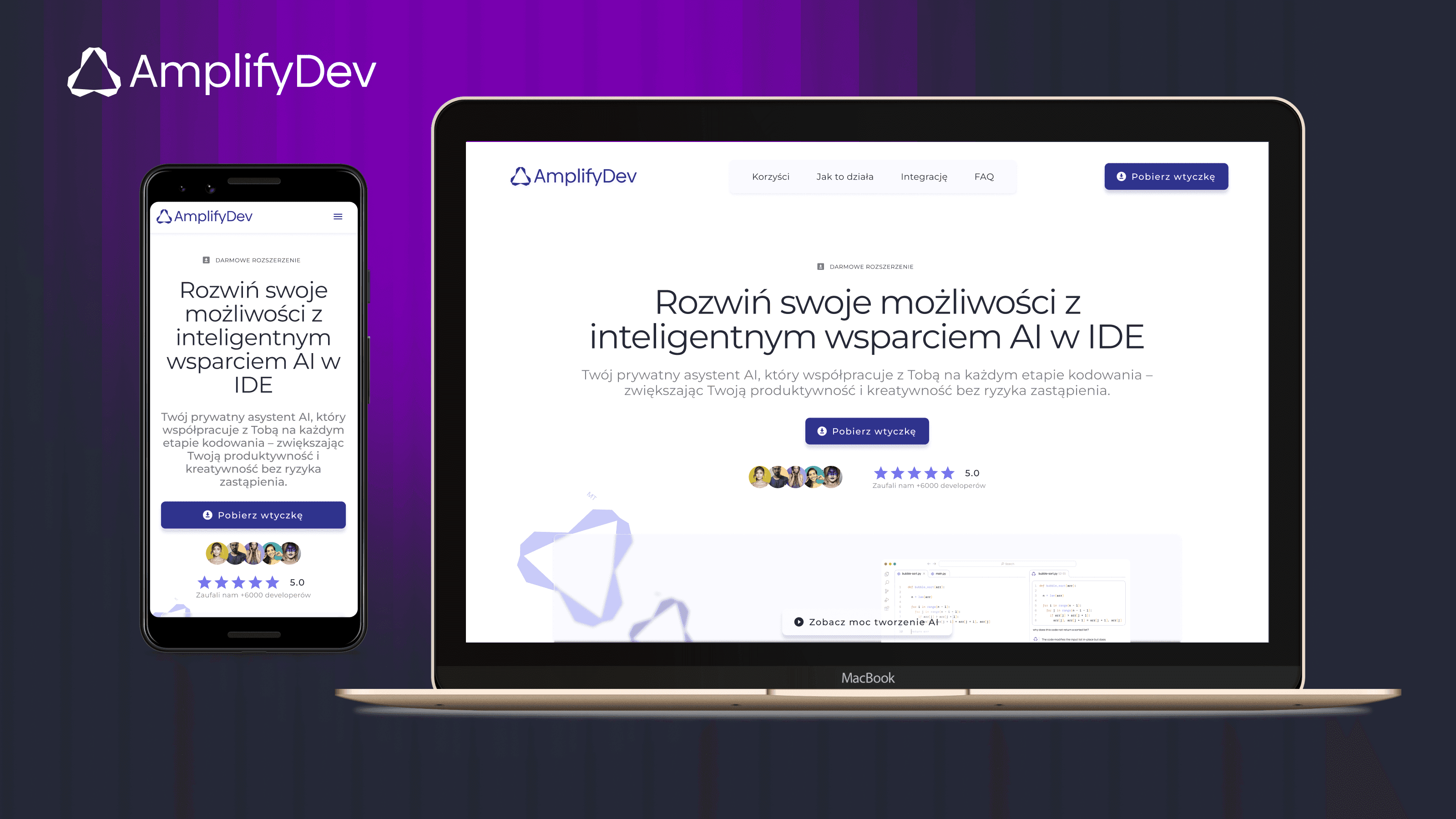
Case study | 5 min read
AmplifyDev – AI Coding Assistant Landing Page
As part of the 5-week UX/UI challenge organized by the Design Cursor community, I designed a landing page for the brand AmplifyDev – the creator of the open-source AI Coding Assistant.
View project