UX Audit | 7 min read
UX Audit – InsERT S.A. Website
A UX audit of key sections of the InsERT S.A. website — including the homepage, Subiekt nexo PRO product page, and “Download a Trial” form — identifying usability, accessibility, and performance issues and providing clear, prioritized recommendations for improvement.
Timeline
-
Industry
B2B Software
My role
UX Designer
Project type
Solo project
Scope
Heuristic Evaluation
Cognitive walkthrough
Accessibility review
Expert audit with prioritization
Performance analysis

If you want to see more, keep scrolling :)
One-minute project overview
Problem
InsERT S.A. — a leading Polish software provider — had a well-established brand but a website that showed critical usability, accessibility, and performance issues in key conversion areas. These weaknesses risked lowering trust, increasing user frustration, and reducing trial downloads.
Problem space challenges & realisations
The challenge was to evaluate a large, content-heavy corporate site through the lens of both user experience and business goals. The complexity of product information, inconsistent mobile responsiveness, and unclear CTAs required a structured, evidence-based audit approach. It became clear that without prioritization, the client risked spreading development resources too thin.
Solution
I conducted a targeted UX audit of the homepage, product page (Subiekt nexo PRO), and “Download a trial” form. Using heuristic evaluation, cognitive walkthroughs, accessibility checks, and performance analysis, I identified 58 issues — then prioritized them using the Impact / Effort Matrix to create a clear, actionable roadmap for improvements.
Results
37 identified issues: 4 critical, 22 major, 10 minor, 1 cosmetic.
Clear prioritization by impact and effort for quick wins and strategic changes
Recommendations ready for immediate implementation by marketing and IT teams
Increased client awareness of accessibility, mobile optimization, and performance best practices
Audit objectives
Methodology
The UX audit covered three key areas of the InsERT S.A. website:
Homepage – first impressions, clarity of messaging, brand consistency.
Subiekt nexo PRO product page – product positioning, content hierarchy, conversion potential.
“Download a trial” form – usability, accessibility, and error prevention.
The goal was to identify usability, accessibility, and performance issues that could impact conversion, trust, and user satisfaction.
Methods used
Method | Description | Tools |
|---|---|---|
Heuristic Evaluation | Evaluated interface against established usability principles (Nielsen's 10 heuristics). | Expert review, UX checklists |
Cognitive Walkthrough | Simulated typical user journeys to assess clarity and ease of completing tasks. | Scenario-based walkthrough |
Accessibility Review | Assessed compliance with WCAG guidelines, focusing on color contrast, keyboard navigation, and alternative text. | WAVE |
Performance Analysis | Measured site speed, loading times, and resource optimization | Lighthouse |
Prioritization | Ranked identified issues by severity, user impact, and business impact to create an actionable roadmap (quick wins vs. long-term fixes). | Impact / Effort Matrix |
Why this mix of methods?
Combining heuristic, cognitive, accessibility, and performance reviews ensured that the audit addressed both qualitative (user experience) and quantitative (technical performance) factors — creating a balanced, evidence-based set of recommendations.
Key focus areas

Severity scale

Key findings
Hero section
The homepage hero carousel is the first and most prominent element users see — making it critical for communicating value, building trust, and driving action. During the audit, I identified several usability, accessibility, and consistency issues that could significantly affect conversion rates and brand perception.
The table below summarizes the findings, ranked by severity (from critical to cosmetic), along with their potential impact and recommended solutions.
Severity | Finding | Impact | Recommendation |
|---|---|---|---|
🔴 Critical | Text in slides as PNG images | Prevents screen readers from reading the content, harms SEO, and makes text editing difficult. | Replace image-based text with real HTML/CSS text, styled to match the current design. |
🔴 Critical | Buttons embedded in images | Makes interaction difficult on different devices, especially mobile; prevents scaling and reduces accessibility. | Replace with interactive HTML/CSS |
🟠 Major | No clear value communication | Phrases like “Join satisfied users” don’t explain the actual benefits to the user. | Use benefit-driven copy, e.g., “Boost your workflow efficiency with advanced finance tools. Join thousands of companies who save time and deliver better client service with InsERT NEXO PRO.” |
🟠 Major | Missing social proof & risk reducers | Lack of visible testimonials, user counts, or trial guarantees reduces trust. | Add testimonials, brand logos, user statistics, and a “money-back guarantee” or free trial to lower purchase hesitation. |
🟠 Major | Ineffective “Check” CTA text | “Check” is vague and doesn’t set user expectations. | Use more specific CTAs like “View Offer” or “Start Free Trial” to clarify the next step. |
🟡 Minor | No arrow navigation in the carousel | Small grey dots make it unclear the carousel is navigable. | Add left/right arrows and descriptive slide labels (e.g., “Offer 1: Subiekt nexo”). |
🟡 Minor | Lack of details about the promotion "Only now -50% cheaper". | Reduces credibility; it is not known what the discount covers and how long it lasts. | Specify the message: discount amount, offer end date. |
🔵 Cosmetic | Different button styles across slides | Inconsistent button colors, sizes, and fonts create visual noise. | Standardize button design for consistency and recognizability. |
Homepage Audit
The homepage combines multiple product lines, dense text, and inconsistent visual patterns, leading to cognitive overload and reduced clarity. The table below outlines critical to cosmetic issues, their impact, and targeted recommendations for improvement.
Severity | Finding | Impact | Recommendation |
|---|---|---|---|
🔴 Critical | Multiple product lines merged in one section | Nexo and GT products are listed together without clear distinction, causing decision friction. | Separate into dedicated sections or tabs with clear labels such as “Nexo Line” and “GT Line”. |
🟠 Major | Low contrast in CTAs and headings | Multiple elements (buttons, headings, links) have ratios as low as 2.18:1, failing WCAG AA. | Adjust colors to meet 4.5:1 (normal text) and 3:1 (large text) contrast requirements. |
🟠 Major | Vague CTA labels | Buttons like “Sprawdź” and “Kup online” don’t set expectations or indicate the next step. | Use benefit-focused labels like “Start Free Trial” or “Order Online Now”. |
🟠 Major | Equal-weight CTAs for different paths | “Kup online” and “Znajdź sprzedawcę” appear side-by-side with identical weight, creating confusion. | Separate into distinct sections with contextual info and unique styling for each path. |
🟡 Minor | Overloaded content blocks | Sections combine unrelated topics (e.g., 4 apps + 6 business types) in a single area | Break into smaller, focused sections or use tabbed navigation. |
🔵 Cosmetic | Redundant alt text | Alt attributes repeat visible on-screen text without adding context. | Provide descriptive, value-adding alt text that supplements visible content. |
Subiekt nexo PRO Product Page
The table below presents key usability, accessibility, and content issues identified on the Subiekt nexo PRO product page, along with severity levels and actionable recommendations for improvement.
Severity | Finding | Impact | Recommendation |
|---|---|---|---|
🟠 Major | Unclear value proposition | The hero section focuses on features (“extended version”, “additional solutions”) but doesn’t clearly state user benefits. | Rewrite hero copy to focus on benefits, e.g., “Advanced sales management that saves time and boosts efficiency.” |
🟠 Major | No social proof or risk reducers | The page lacks customer testimonials, user counts, or risk-reducing elements (e.g., money-back guarantee) | Add testimonials, client logos, user stats, and a free trial or refund guarantee. |
🟠 Major | Equal-weight CTAs create confusion | “Buy Now” and “Download Demo” have the same visual weight, making it unclear which action is primary. | Highlight the primary CTA with a distinct color, size, or placement; make the secondary CTA less dominant. |
🟠 Major | Low contrast in key UI elements | Links such as “Full functionality list” (2.71:1 contrast) fail WCAG AA standards | Adjust colors to meet at least 4.5:1 contrast ratio for normal text and 3:1 for large text. |
🟡 Minor | Unclear links | Using the word “here” in hyperlinks makes their purpose unclear. | Replace with descriptive links, e.g., “View printer list”. |
🟡 Minor | “Wall of text” | Tabs such as “Description”, “Basic Features” and others contain overly long, dense content. | Use short paragraphs, headings, icons, and highlighted benefits. |
🟢 Best Practice | Product image in hero | Shows the product visually, aiding quick comprehension. | Maintain product imagery but ensure alt text is descriptive. |
🟢 Best Practice | Clear CTAs in hero | “Buy Now” and “Download Demo” give users both a direct purchase and a trial option. | Keep dual CTAs but visually prioritize one. |
🟢 Best Practice | Sticky “Try for Free” button | Keeps a key action visible at all times. | Continue using sticky CTA for easy access. |
🟢 Best Practice | Tabbed content for features | Organizes large amounts of information efficiently. | Retain but reduce the total number of tabs for clarity. |
Accessibility & Performance audit
The table below outlines the main usability and accessibility issues found in the Contact Form, with severity ratings and targeted recommendations to enhance clarity, efficiency, and user experience.
Severity | Finding | Impact | Recommendation |
|---|---|---|---|
🔴 Critical | No form validation | The contact form lacks real-time validation for fields such as postal code, city, phone, and email, which can cause submission errors and user frustration. | Implement inline validation with clear error messages indicating the field and type of issue. |
🟠 Major | Poor label-to-field association | Consent checkboxes for Email/Phone/SMS are not clearly linked to their labels, creating confusion. | Properly associate labels with form inputs and increase spacing between groups. |
🟠 Major | Low contrast in labels and links | Labels and links such as “Here” have contrast ratios between 2.71:1 and 3.8:1, failing WCAG AA standards. | Adjust colors to meet at least 4.5:1 for normal text and 3:1 for large text. |
🟠 Major | No “Check NIP” functionality | The NIP field doesn’t offer a quick company lookup. | Add a “Check NIP” button to auto-fill company details from a public database. |
🟡 Minor | Missing labels for date/time fields | “Preferred contact time” fields lack descriptive labels. | Add clear labels for both date and time fields. |
🟡 Minor | All form fields marked as required | Asterisk indicators for all fields cause visual clutter. | Replace with a single note: “All fields are required.” |
🟡 Minor | Label placement in forms | Labels are positioned far from input fields, reducing usability. | Use floating labels that move above the field when focused. |
🟡 Minor | Unclear error messages | The message “Problem with form processing” does not specify details. | Provide precise messages indicating the location of the error and how to fix it. |
Using WAVE and Lighthouse, I evaluated the site for compliance with WCAG 2.1 AA accessibility standards and core web performance metrics. The analysis covered both desktop and mobile views, ensuring the findings reflected real-world user scenarios.
Key accessibility alerts (WAVE)
Alert category | Problem description | Impact on users | Recommendation |
|---|---|---|---|
Low color contrast | CTAs, headings, and links with contrast ratios of 2.18:1–3.59:1 | Difficult to read for users with visual impairments or color blindness | Increase contrast to at least 4.5:1 |
Text in images | Slides and buttons presented as PNG graphics | Invisible to screen readers, reduced SEO performance | Replace with HTML/CSS text |
Missing or redundant alt text | Product images duplicate adjacent visible text | Provides no additional context for assistive technologies | Add unique, descriptive alt text |
Incorrect heading hierarchy | Jumps between H1, H3, H5 without logical order | Makes navigation difficult for screen reader users | Organize headings into a proper hierarchical structure |

Key performance findings (Lighthouse)
Area | Score | Key Issues | Recommendation |
|---|---|---|---|
Performance (Mobile) | 64/100 | Large unoptimized PNG images, render-blocking JS, layout shifts | Image compression, lazy loading, defer JS |
Accessibility | 77/100 | Low contrast, missing labels, text in images | Improve contrast, provide accessible content forms |
Best Practices | 75/100 | Excessive resources loaded on start | Optimize resource loading |
SEO | 83/100 | Missing meta descriptions on some subpages | Add meta descriptions |

Impact on users and conversions
🔹 Accessibility – Issues with contrast and text in images exclude some users from key actions (e.g., downloading a demo version).
🔹 Performance – Large images and delayed interactivity increase bounce rates, especially on mobile devices.
🔹 Business – Reduced accessibility and slow loading negatively affect SEO and conversion rates.
Prioritized recommendations
Impact / Effort Matrix
Using an Impact / Effort Matrix, the identified issues were ranked by their severity, impact on users and business goals, and the effort required to fix. This prioritization helps focus development resources where they will deliver the highest return on investment.


Certificate of completion for the 7-week “UX Audit” course (October 31, 2024), confirming acquired skills in conducting UX audits through a practical final project.
Reflections & Takeaways
This UX audit for InsERT S.A. was more than a checklist of issues — it was a deep dive into how usability, accessibility, and performance intersect to shape the customer journey. While the website offers a solid foundation and a wide product range, the audit revealed that small accessibility gaps and unclear value communication can have a disproportionate impact on conversions and trust.
What worked well
Strong brand credibility that can be leveraged more in messaging.
Effective use of breadcrumb navigation and sticky CTAs to support user flow.
Clear product imagery that helps users quickly understand the offering.
What I learned
Small accessibility changes (contrast, alt text, heading order) can deliver big wins for inclusivity and SEO.
Consistent CTA design and clear value propositions are essential for decision-making.
Performance fixes (image optimization, script deferral) directly improve user patience and perceived quality.
More projects
Curious for more? Here’s what else I’ve been working on.
Case study | 5 min read
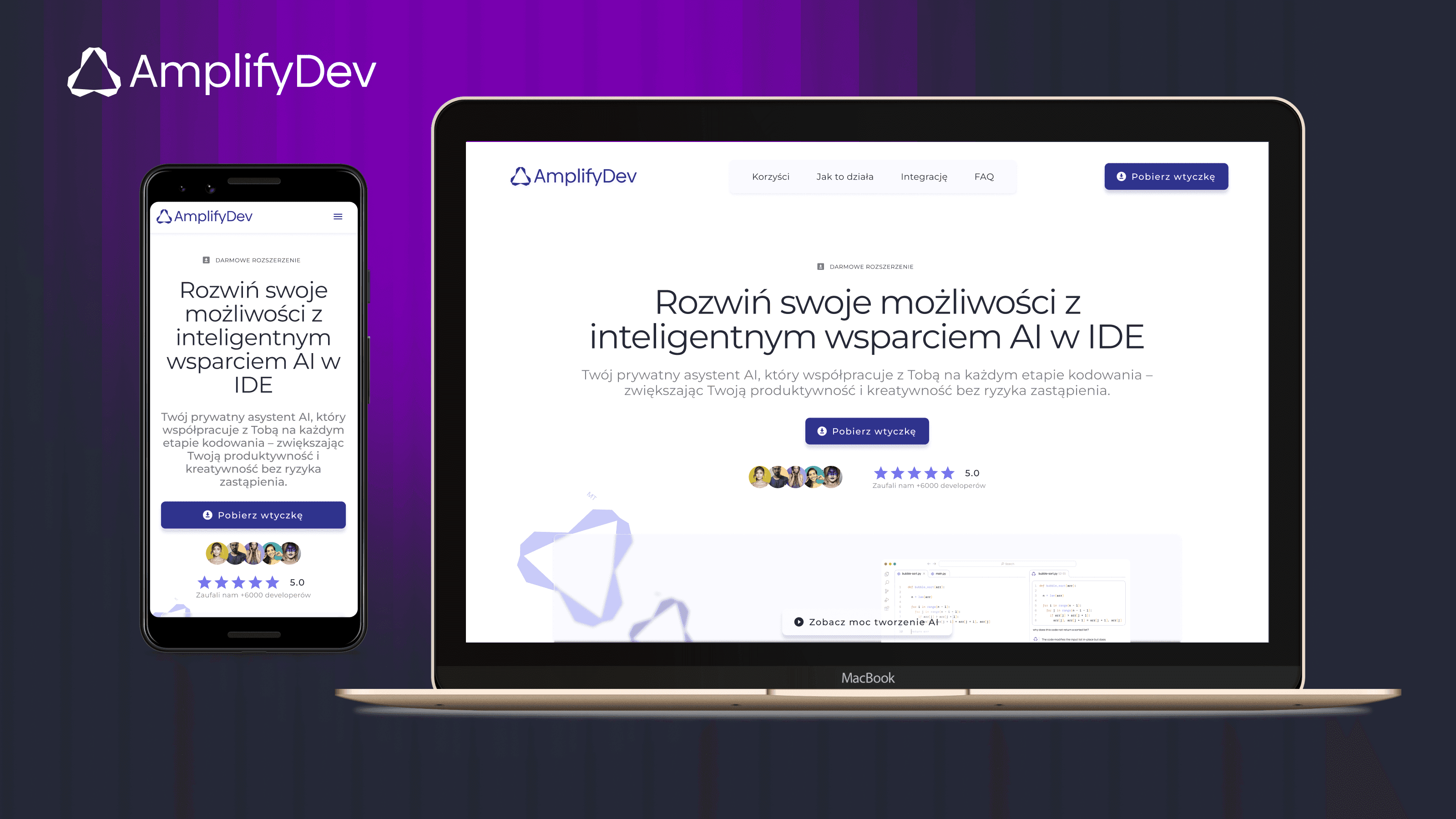
AmplifyDev – AI Coding Assistant Landing Page
As part of the 5-week UX/UI challenge organized by the Design Cursor community, I designed a landing page for the brand AmplifyDev – the creator of the open-source AI Coding Assistant.
View project

Case study | 5 min read
Landing Page for Polish Podcast
"O tym się nie mówi" is a podcast available on Spotify, aimed at strong, mature, and independent women. It addresses important — and often uncomfortable — life topics that inspire reflection and change.
View project