Case study | 5 min read
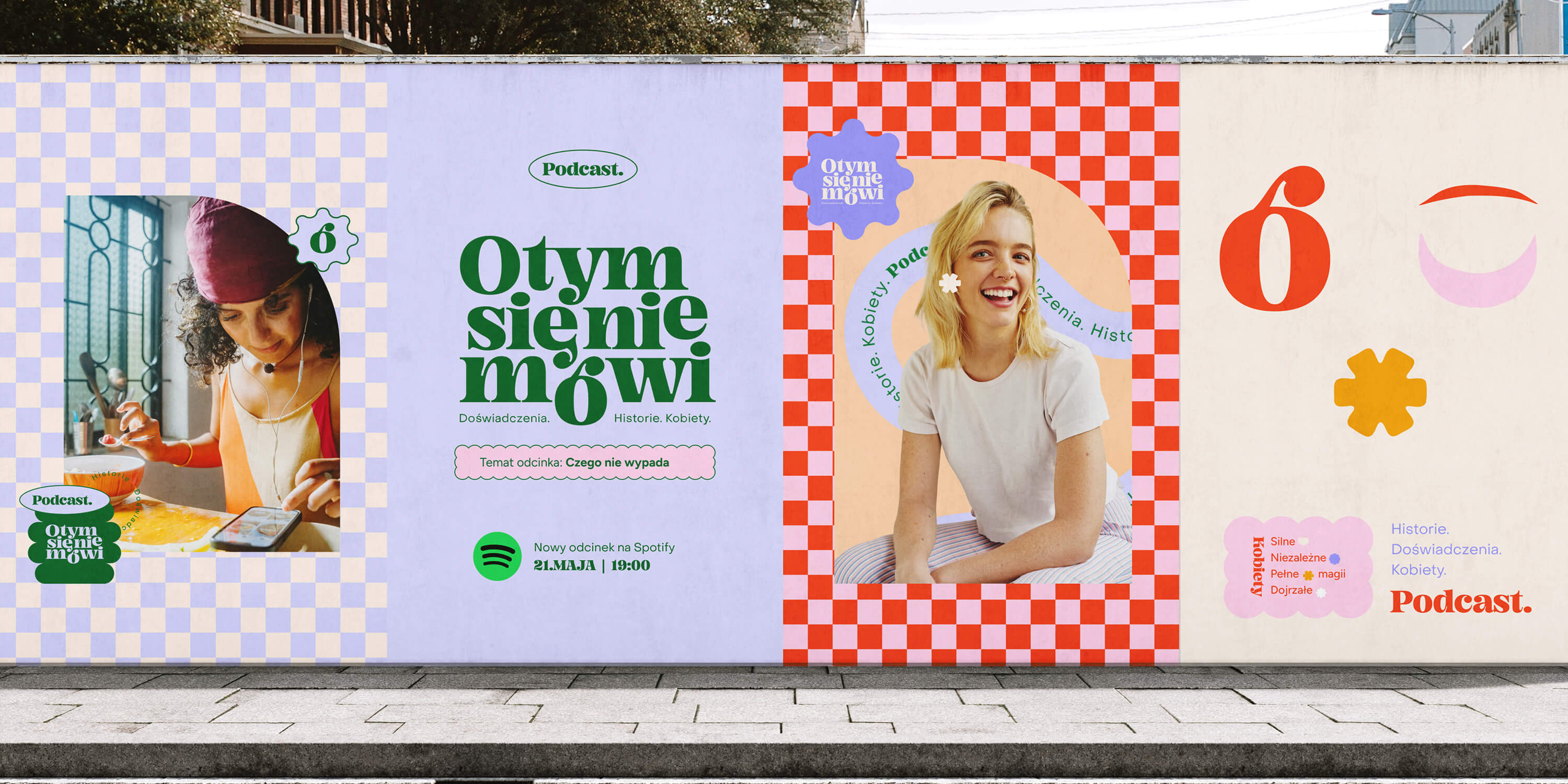
Landing Page for Polish Podcast
"O tym się nie mówi" is a podcast available on Spotify, aimed at strong, mature, and independent women. It addresses important — and often uncomfortable — life topics that inspire reflection and change.
Timeline
-
Industry
Media & Content Creation
My role
UX/UI Designer
Project type
Solo project
Scope
Benchmarking
Information Architecture
Sitemap
Wireframing (lo-fi / hi-fi)
UI Kit
Prototyping (Figma)
Responsive Design

If you want to see more, keep scrolling :)
One-minute project overview
Problem
The podcast “O tym się nie mówi” had a strong brand and a loyal community, but lacked a cohesive, professional landing page that would combine informative, promotional, and engagement functions.
Problem space challenges & realisations
The site needed to reflect the podcast’s tone of voice — subtle, powerful, and authentic — while resonating with a very specific female audience. One of the key challenges was creating a space that represents three hosts with distinct personalities while maintaining clarity and consistency.
Solution
I designed a fully responsive landing page in Figma with clear structure, navigation, and content. The project was based on the existing brand identity by Teresa Chylińska-Kur, and included a tailored UI Kit, interactive prototype, and analysis of the target audience.
Results
A clean and cohesive layout in three breakpoints (desktop, tablet, mobile)
Integrated Spotify, Instagram, and contact form;
Custom content aligned with the podcast’s tone of voice;
Fully clickable prototype and design system in Figma.
▶️ View the full Figma prototype (desktop, tablet, mobile)
Demo project published in Framer
Goals & Success criteria
Research & Insights
To create a landing page aligned with both the brand and its audience, I started with a multi-layered research process.
Audience & brand immersion
To understand the podcast’s values and tone of voice, I:
Reviewed Instagram content and episode descriptions;
Listened to multiple episodes to grasp the hosts’ personalities and message style;
Analyzed how the hosts described their mission and relationship with the community;
Identified user expectations: quick access to episodes, approachable tone, trust, and simplicity.
Competitor landscape
While the podcast already had strong content and a loyal following, I noticed that many similar podcasts lacked dedicated websites — or relied solely on social media and Spotify. I compared the digital presence of other well-known Polish podcasts in the same space:
Direct competitor comparison
Podcast | Dedicated website | Engagement tools | Key channels | Visual brand |
|---|---|---|---|---|
O tym się nie mówi | ✅ Yes (this project) | CTA, contact form, Spotify embed | Instagram, Spotify | Strong, custom |
Słucham, gadam | ⚠️ Yes (basic blog layout) | Minimal (no CTA or form) | Blog, Spotify | Moderate |
Tu Okuniewska | ❌ No | None — Instagram only | Spotify, Apple, Instagram | Strong on IG |
Godzina Czasu | ❌ No | None | Streaming platforms only | Basic |
🟡 Insight: Most direct competitors don’t offer a structured digital experience. This landing page fills that gap — with clear navigation, contact tools, and a coherent brand narrative.
UI/UX benchmarking
To inform the visual strategy, I also conducted a UX/UI audit of 15+ podcast and media-related landing pages — including unrelated sites with strong visual or structural ideas. I focused on:
Homepage layouts
CTA placements
Typography & color systems
How podcast episodes are presented
Emotional tone in content
Selected UX benchmarks
🎙️ Design Practice Podcast | 🎧 DesignZima Podcast | 💬 Brandoholik Podcast |
|---|---|---|
Strengths:
| Strengths:
| Strengths:
|
Weaknesses:
| Weaknesses:
| Weaknesses:
|
🟡 These insights directly shaped the sitemap, layout decisions, and CTA strategy in my final design.
Wireframes – from blueprint to layout
After defining the content models and sitemap, I moved into wireframing to test how the structure works visually and functionally. Working in grayscale allowed me to focus on layout, spacing, and visual hierarchy — without getting distracted by styling details too early.
My goal was to validate:
the order of content blocks,
the visibility and position of CTAs,
and the overall scroll rhythm — especially on mobile devices.
UX strategy & Information architecture
Clarity starts with structure
Before designing the interface, I focused on building a clear, scalable content strategy. I started with content models to define reusable blocks for episodes, guests, and the contact form — making the design flexible and easy to maintain.
Next, I mapped out a simple, scroll-based sitemap. Guided by competitor research and audience needs, the layout leads users naturally from discovery to listening and interaction.
Together, modular content and mobile-first flow ensure a smooth and intuitive experience across devices.
Visualizing the content structure
To validate the content hierarchy before diving into UI design, I created a gray-box wireframe of the landing page. This block-level blueprint helped organize different content types — such as episodes, testimonials, and guest highlights — into a clear, scroll-friendly flow.
Each block was labeled by its intent: informative, emotional, or action-driven — creating a balanced rhythm that matches how users browse, absorb, and engage with content.
Visual blueprint outlining the layout strategy and content hierarchy for the landing page.
Wireframes – from blueprint to layout
After defining the content models and sitemap, I moved into wireframing to test how the structure works visually and functionally. Working in grayscale allowed me to focus on layout, spacing, and visual hierarchy — without getting distracted by styling details too early.
My goal was to validate:
the order of content blocks,
the visibility and position of CTAs,
and the overall scroll rhythm — especially on mobile devices.
UI design & Interaction
Designing a soft yet confident brand presence
To reflect the podcast’s tone — strong yet subtle, bold yet warm — I developed a clean, emotionally engaging interface based on the brand’s existing identity.
UI Kit
I created a detailed UI Kit in Figma, using principles of Atomic Design. The system includes:
Color palette and typography tokens
Button variants and icons
Grid systems for desktop, tablet, and mobile
Reusable components such as episode cards, forms, and guest modules
This setup ensured visual consistency, design scalability, and efficient prototyping throughout the process.
Full UI interaction preview
To better demonstrate the flow and feel of the interface, I recorded a walkthrough of the entire landing page — covering the desktop, tablet, and mobile versions.
The video captures key microinteractions that bring the design to life:
– A dynamic header that cycles through empowering adjectives for women
– Smooth hover animation on the main CTA button
– A success state animation after submitting the contact form
These details were crafted to make the experience feel intuitive, responsive, and emotionally in tune with the podcast’s tone — blending functionality with meaning.
Expert review
I consulted the project with fellow designers, who confirmed the design felt clear, emotionally engaging, and well-structured across devices.
Their input helped me fine-tune microinteractions and ensure a mobile-first, intuitive experience.
Outcome & Reflections
This project was especially close to my heart — not only because of the mission behind the podcast, but also because I had the chance to design for an audience I deeply resonate with: strong, self-aware, evolving women.
It taught me how to turn subtle emotions into visual language, and how important it is to really feel the brand before you design anything.
I also realized how much power lies in the little things — the right word, the right hover effect, the right rhythm between sections — all of it adds up to a meaningful experience.
More projects
Curious for more? Here’s what else I’ve been working on.

UX Audit | 7 min read
UX Audit – InsERT S.A. Website
A UX audit of key sections of the InsERT S.A. website — including the homepage, Subiekt nexo PRO product page, and “Download a Trial” form — identifying usability, accessibility, and performance issues and providing clear, prioritized recommendations for improvement.
View project
Case study | 5 min read
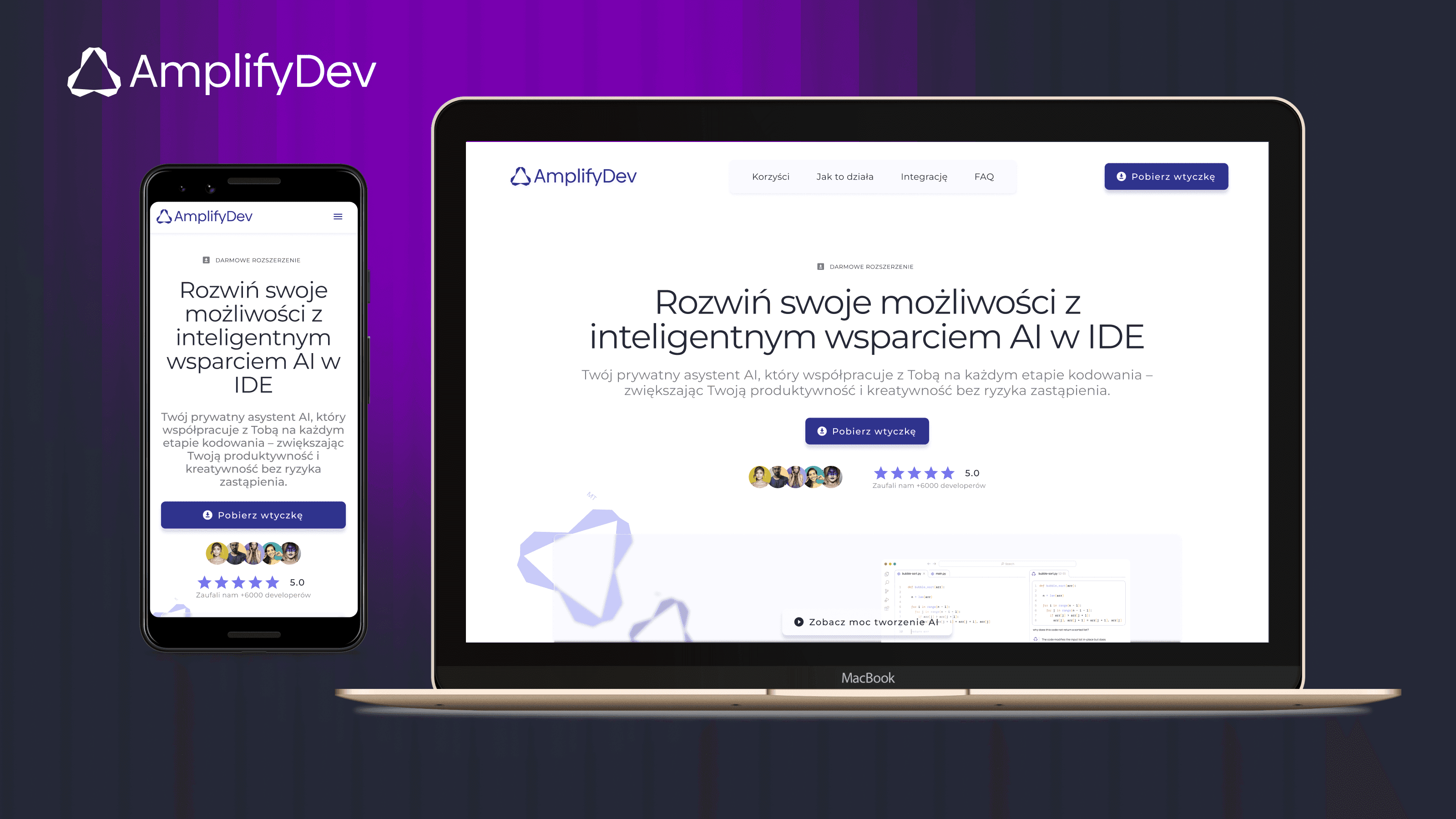
AmplifyDev – AI Coding Assistant Landing Page
As part of the 5-week UX/UI challenge organized by the Design Cursor community, I designed a landing page for the brand AmplifyDev – the creator of the open-source AI Coding Assistant.
View project