Case study | 5 min read
AmplifyDev – AI Coding Assistant Landing Page
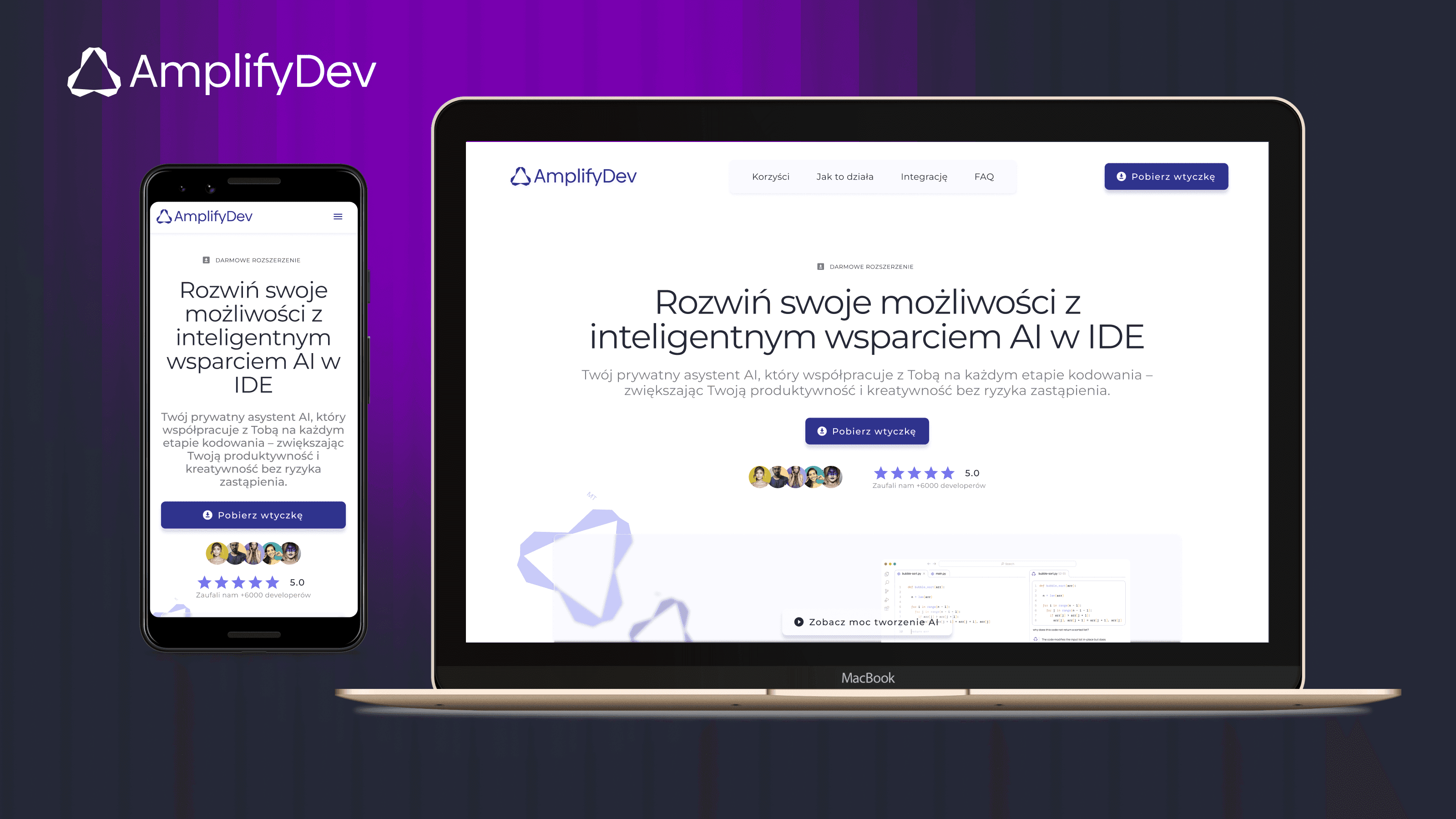
As part of the 5-week UX/UI challenge organized by the Design Cursor community, I designed a landing page for the brand AmplifyDev – the creator of the open-source AI Coding Assistant.
Timeline
-
Industry
Technologia & IT
My role
UX/UI Designer
Project type
Solo project
Scope
Benchmarking
Information Architecture
Sitemap
Wireframing (lo-fi / hi-fi)
UI Kit
Framer Development
Scroll & Hover Effects
Responsive Design
If you want to see more, keep scrolling :)
One-minute project overview
Problem
AmplifyDev needed a landing page that clearly communicated the value of its open-source AI Coding Assistant — a tool designed to boost productivity for senior developers. The key challenge was to explain complex features in a way that felt simple, credible, and compelling.
Problem space challenges & realisations
Designing the landing page required balancing clear communication of complex features with the expectations of a highly technical audience. At the same time, I needed to ensure responsiveness, visual clarity within a glassmorphism style, and a smooth user journey across all devices.
Solution
I designed a clean, responsive landing page that presents the core features with clarity, showcases real value, and leads users to one clear CTA: “Download the plugin”. The layout is content-first, branded, and optimized for quick understanding.
The visual direction was built on the brand foundations created by Teresa Chylińska-Kur, who provided a strong and refined identity that guided key UI decisions — from colors and typography to the overall tone and style.
Results
High-fidelity, interactive prototype (desktop, tablet, mobile);
Modular UI Kit and consistent design system;
Positive feedback from mentor;
Completed challenge and earned certification;
MVP-ready landing page built to convert.
Demo project published in Framer
Goals & Success criteria
Research & Insights
Brand analysis
Before diving into the UX strategy, I conducted a deep dive into AmplifyDev’s brand identity. I analyzed its visual tone, messaging, values, and the concept of “amplification” linked to light and prisms. The product needed to feel powerful yet simple — visually bold, but grounded in clarity. This informed key design choices, including the use of glassmorphism, bright gradients, and clean typography.

Each visual and structural decision — from layout and typography to color palette and interaction style — was directly shaped by AmplifyDev’s brand attributes, ensuring a design that feels both technically credible and visually aligned with the product’s identity.
Competitor benchmarking
To support my design strategy, I explored a wide range of landing pages — both developer-centric and visually experimental — including sites that use glassmorphism, advanced animations, and modern UI patterns. Among them, I selected three standout examples for deeper analysis: kleo.so, continue.dev, and kiro.dev. These products share a similar audience and value proposition to AmplifyDev, making them relevant for direct comparison.
I focused on four core aspects: structure, clarity, tone, and conversion logic. Here’s a summary of the findings:
Website | Strengths | Weaknesses |
|---|---|---|
kleo.so | • Minimalist, well-balanced layout | • Lacks visual engagement or interactivity |
continue.dev | • Technical credibility with real-code visuals | • Weak visual hierarchy in lower sections |
kiro.dev | • Smooth microinteractions and polished animations | • Performance lags on mobile devices |
Key takeaways
Minimalist design is effective, but it must be paired with clear, specific messaging
Glassmorphism and animations should enhance usability — not distract from it
Technical credibility can be built using real screenshots, terminal views, or plugin previews
Conversion-focused structure should bring value upfront and guide the user toward one clear action

Audience insights
The target audience for this landing page was senior developers — experienced professionals who value speed, efficiency, and control over their tools. Unlike junior devs or casual users, they don’t need hand-holding or fluff; they want straightforward communication, technical credibility, and immediate value.
Key audience traits:
Efficiency-driven – They work fast and expect tools to help them work faster
Skeptical by nature – They prefer proof over promises
Minimalist mindset – They appreciate clean interfaces without distraction
Tech-literate – They understand features quickly, so long explanations feel redundant
UX implications:
Prioritize clarity over persuasion – let the product speak for itself
Use realistic examples, not abstract promises
Place key features above the fold for quick scanning
Avoid overly decorated UI – focus on performance and readability
These user insights directly informed the tone of voice, content structure, and visual decisions throughout the landing page.
UX strategy & Information architecture
My approach to UX strategy was rooted in creating a clear, frictionless user journey for senior developers — a group that values speed, transparency, and actionable content. The process consisted of three key phases: defining the sitemap, building the UX blueprint, and testing layout flow through wireframes.
Sitemap: structuring the story
The sitemap helped me map out the entire content flow and define the purpose of each section. It acts as a narrative spine for the landing page — introducing the product, highlighting its benefits, addressing user concerns, and guiding users toward one clear action: downloading the plugin.

UX Blueprint: designing with intent
The blueprint expanded the sitemap into structured wireframe logic. I defined each content block’s role and how it contributes to product understanding, trust, or conversion.

Wireframing: bringing the structure to life
With the blueprint as a foundation, I created low-fidelity wireframes for desktop, tablet, and mobile breakpoints. My goal was to validate content hierarchy, section spacing, and user flow before diving into UI design.
I used a modular approach based on bento-style blocks to maintain visual rhythm and ensure flexibility in responsive layouts. These wireframes also helped test CTA positioning, scannability, and readability across devices.

UI design & Interaction
Designing the final interface was about more than just making it look good — it was about translating UX priorities, brand attributes, and content structure into a visual system that’s coherent, scalable, and delightful to use.
Building a UI Kit
I created a custom UI Kit for AmplifyDev using Atomic Design principles. This helped me stay consistent across breakpoints and build faster without duplicating styles.
The UI Kit includes:
Typography: Biennale sans-serif for clarity and consistency
Color palette: Smoky purples, dark navy backgrounds, and soft gradients
Buttons & Inputs: Primary, secondary, ghost styles with hover states
Glassmorphism containers: Translucent blocks with subtle shadows
Iconography & spacing rules: Defined for scalability
Creating the UI Kit in parallel with Hi-Fi designs ensured consistency across all devices and accelerated the prototyping process.

Interactive prototype walkthrough
To showcase the final landing page across breakpoints, I recorded a scroll-through in Figma — from desktop, to tablet, to mobile. It highlights:
The visual flow and content hierarchy;
Responsive layout behavior;
Smooth transitions between screen sizes;
Application of the UI Kit in real context.
👉 View the demo project in Framer
Expert review
Testing with expert eyes
While I didn’t run formal usability tests with end users, the final version of the prototype was thoroughly reviewed by Teresa Chylińska-Kur – Senior UI Designer, Art Director, and mentor of the Design Cursor challenge. Her expert review focused not only on visual design, but also on structure, usability, interaction logic, and brand alignment.
Her detailed feedback helped me refine the design — both visually and strategically — and allowed me to push the layout beyond "correct" into something more expressive and emotionally balanced.
Positive highlights from the review:
Figma file organization: praised as “beautiful, clean, and well-named — like walking into my own house”;
Component logic: appreciated for modular structure and thoughtful use of sections;
Visual rhythm: clear CTA flow and nice use of color to emphasize priority areas;
Benchmark analysis: well-documented and aligned to each section of the layout;
Design habits: called out as “excellent” — with strong naming conventions and layout discipline;
UI details: small touches like header/CTA color highlights were noticed and appreciated.

Design-level suggestions for further improvement:
Soften the structure: encouraged to go beyond strict frame-based logic and explore more expressive layouts;
Rethink the hero navbar: suggestion to add glassmorphism and make it feel lighter and more integrated;
Use color more freely: advised to experiment with contrast and playful accents in a few areas;
Allow more visual freedom: prompted to “think like a designer, not a layout machine” to bring more life into the UI.
Outcome & Reflections
What I delivered
In just five weeks, I designed a fully responsive landing page for AmplifyDev — a technical product aimed at experienced developers — and built a solid design system to support it. The project included:
Brand analysis
Sitemap and UX blueprint
Low- and high-fidelity wireframes
Atomic-based UI Kit
Responsive hi-fi mockups
Interactive prototype
Expert feedback and iteration
📄 I also received a certificate of completion and positive recognition from the mentor for the structure, thought process, and execution quality.

Key takeaways
Designing for developers taught me to focus on clarity, not persuasion — they care more about functionality than flashy storytelling.
Working within a brand identity helped me balance creative freedom with visual constraints (glassmorphism, muted palette, typography).
Iterating with expert feedback reminded me to loosen up visually — to not only think in frames and grids, but also in emotion and user rhythm.
I reinforced my habits of working modularly, naming consistently, and designing system-first.
More projects
Curious for more? Here’s what else I’ve been working on.

UX Audit | 7 min read
UX Audit – InsERT S.A. Website
A UX audit of key sections of the InsERT S.A. website — including the homepage, Subiekt nexo PRO product page, and “Download a Trial” form — identifying usability, accessibility, and performance issues and providing clear, prioritized recommendations for improvement.
View project

Case study | 5 min read
Landing Page for Polish Podcast
"O tym się nie mówi" is a podcast available on Spotify, aimed at strong, mature, and independent women. It addresses important — and often uncomfortable — life topics that inspire reflection and change.
View project